
Table of Contents
Planning a remodel? See the full Holistic Home Remodeling Guide on Amazon →
Note: If you came to this post on color and culture through a random search, please click on this parent page and our home page for more context.
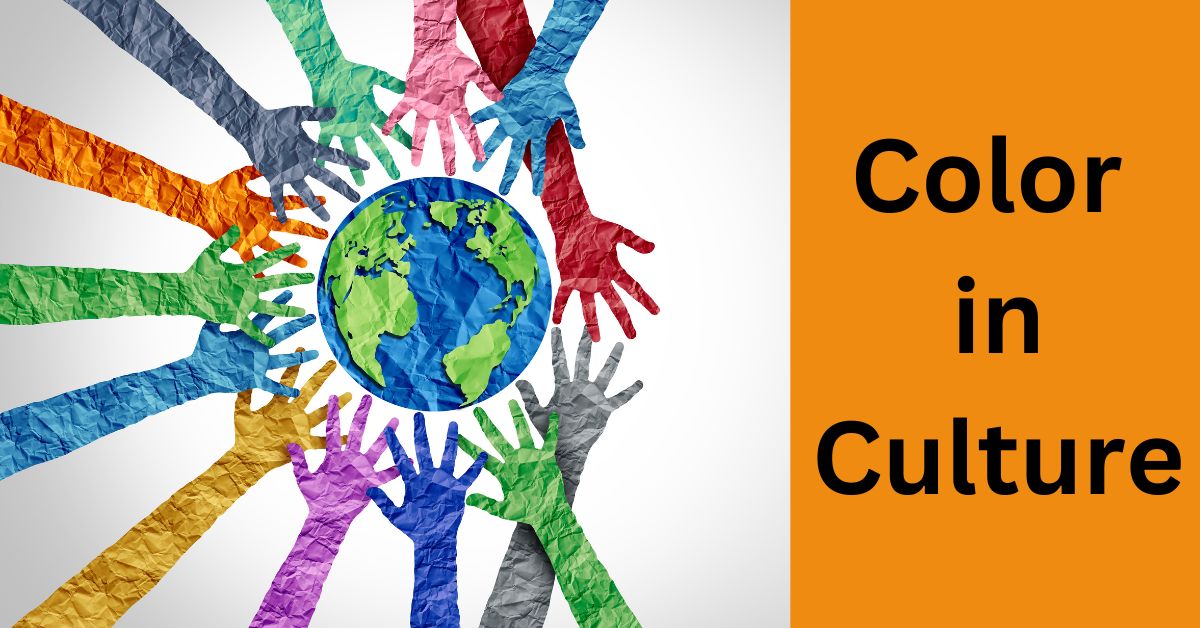
Understanding Color in Culture
An understanding of the meaning of color in culture can help you add the personality of your own cultural heritage to your remodel project.
In our related post on color in design, we mentioned Learned Color Perception. We live in an increasingly diverse society and the perception of color in the home may be influenced not only by personality but also by perceptions of color we learned growing up in our own cultural environment.
- Related post: Color in Design
- Related post: Design Elements & Principles
In that post, we laid out the principal uses of the various color families in design. We also referred to just some of the known cultural significance and symbolism of individual colors. Color has such an ingrained impact on our perceptions that it can literally “color” how we view something and our next action.
- Further reading on Amazon

Colour and Culture
- Practice and Meaning
- From Antiquity to Abstraction
We live in a country made up of people that come from many different cultural backgrounds. Many of these cultures are associated with their own traditional color preferences. So here we explore these color associations. And also how some of these colors might be employed in a remodeling project in a way that expresses our own cultural heritage.
Red
Red in Design
Red is a powerful color. It has been shown to have a physical effect, such as raising blood pressure and respiration rates. Red can have an overwhelming effect on a design.
In its purest form, it should be used sparingly and as an accent. For example, a little red can add warmth to a room that is using a palette taken from the cool color family.
It can also add drama when used in a small space like a powder room. Red and black is a classic and very dramatic combination and definitely not for the faint of heart.
On the other hand, in shades of merlot or rust and used with other colors, red is very versatile. It can impart great warmth to a color scheme, whether the style is contemporary or traditional.
Red in Culture
In the Western world red is the color of love (Valentine’s Day and Cupid). It is also the color of passion, sacrifice, and anger. It is the color of danger (stop signs), importance (red carpets), violence, and warfare.
In China, red is the color of good luck and prosperity (Chinese New Year), vitality, happiness, and long life.
In India red is the color of wealth and opulence, purity, fertility, love, and beauty. It is used in wedding ceremonies and is the sign of a married woman. It is the color of fear and fire.
In South Africa, red is the color of mourning.
For Australian Aborigines, it is the color of the land, earth, and ceremony.
Orange
Orange in Design
Orange is like red in that the brighter it is the more sparingly it should be used. It is a vibrant and energetic color associated with sunshine, health, vitality, and the citrus fruit of the same name.
In its more subdued forms, orange is associated with the earth and autumn. Like red, orange demands attention but is friendlier and more approachable. In its variations of peach, apricot, and terra cotta, orange can add happiness. It can add a warm invitation to a color scheme without being overdramatic.
Orange in Culture
In the Western world, orange is the color of energy, creativity, happiness, and inexpensive items. It is (together with black) the color of Halloween. It is a religious color for Irish Protestants and the color of the Dutch royal family.
In the eastern world orange is the color of happiness and spirituality. In Eastern philosophy, the Orange Chakra is in the abdomen and is the creative center.
Yellow
Yellow in Design
Yellow is the brightest and most energizing of the warm colors. It adds optimism and prompts feelings of happiness. It is an uplifting color believed to stimulate memory and the nervous system. It promotes communication and sparks creativity.
Yellow is a difficult color to use because, perhaps more than with any other color, the same shade can look very different under a different light.
On the other hand, yellow is very versatile in creating mood. A light yellow is calmer than a dark yellow. A muted yellow becomes a soothing neutral color. A pale yellow can enlarge a small room and simultaneously make it feel good.
Dark yellows work well with natural wood and can help create a sense of permanence. Soft yellows are often used as a gender-neutral color in a baby’s nursery.
Yellow in Culture
In the Western world, yellow is the color of sunlight and cheerfulness. It is the color of hope (yellow ribbons), spirituality, and enlightenment. It is also the color of cowardice, deceit, and illness (jaundice).
In Japan yellow means courage and nobility. Buddhist monks wear saffron yellow robes.
In Egypt yellow is the color of mourning but, elsewhere in the Middle East, it represents prosperity.
In China yellow is the color of royalty and respect. During the 1800s the best graphite in the world came from China. And this is why, since the 1890s, American pencil makers have made that regal association by painting their pencils bright yellow.
Blue
Blue in Design
Blue conveys peace, tranquility, harmony, trust, and confidence. In design, it is a shade of blue that has an impact. Light blues are relaxed and calming. Bright blues are energizing. Dark blues suggest strength and reliability.
Blue is closely associated with nature and is a universally popular and “safe” color to use. Nonetheless, it is an emotive color and should be used carefully. Just as red, as in “seeing red,” is emotive, so is blue, as in “feeling blue.”
Even though blue comes from the cool side of the color wheel, it is not a cold color. Pale blues can be harmonious and neutral. Dark shades of blue can even bring warmth to a room, especially when mixed with a little red or yellow.
Blue in Culture
In the Western world, blue is associated with trust and authority, peace and calm, and depression and sadness. It is a masculine color, the color of baby boys. Although in a religious connotation, it is the color of the Virgin Mary’s robes.
In China blue is associated with immortality and is a feminine color.
In Korea, it is the color of mourning.
In the Middle East blue is the color of protection and wards off evil.
Green
Green in Design
Green is the color of life and nature. It represents growth, renewal, balance, harmony, and stability. It comes in many shades, evoking a variety of moods. And this makes it particularly versatile in pairing with other colors.
Appropriate shades of green go well with brown, tan, beige, yellow, orange, and purple. Green is a restful color with some of the same calming attributes as blue. Like blue, it can have both a warming and a cooling effect.
Green can even impart some drama as, for example, a solid emerald green in a powder room.
Green in Culture
In the Western world, green is the color of spring, new birth, kindness, loyalty, and good luck. It is most famously associated with Ireland and the shamrock. It is the color of “go” at traffic signals. Green is also the color of money, greed, and jealousy.
In China, green represents regeneration and hope. It is also the color of infidelity.
In the Middle East green is the color of Islam, strength, fertility, and luck.
In North Africa, it is the color of corruption and drug culture.
In parts of South America, it is the color of sickness and death.
Purple
Purple in Design
Purple is regal and eccentric, moody and mystical, unconventional and creative. It is a
difficult color to use in design. Depending on the tone or shade, it can be dramatic or quiet. However, painting an entire wall purple can overwhelm the contents of any room.
So purple is certainly best used sparingly and as an accent. Purple can range from light lavender to solid plumb with an effect ranging from soft to stunning. For example, when combined with soft blues or greens, or grays, the result is tranquil. When combined with mustard yellow, the result is lively.
Purple in Culture
In the Western world, purple has long been associated with royalty and rank, cruelty and arrogance, wealth and fame. It is the color of military honor (Purple Heart). It is inventive and outrageous, creative and artistic.
- In Thailand purple is the color of mourning for widows.
- In Japan, it is the color of privilege and wealth.
- In India, it is the color of sorrow.
- In Catholicism and Brazil, it is the color of death and mourning.
White
White in Design
To the human eye, too much bright white can be blinding. It is a brilliant color that has been known to cause headaches. So it should be used carefully. Like black, white can work well with almost any color.
In design, white is usually used as a neutral background to give greater emphasis to other colors. For example, in juxtaposition, white will make reds, blues, and greens brighter and more prominent. White is used in minimalist designs to impart clean lines and simplicity.
In other designs, depending on the colors around it, white can be both cool and warm, evoking winter or summer.
White in Culture
In the Western world, white is associated with purity, cleanliness, and virtue. It is the color of the bride’s gown on her wedding day. White is associated with goodness and angels. And is also associated with doctors, nurses, and dentists. White is the color of peace (white doves). In the wild west, the good guys wear white hats, and the bad guys wear black hats.
In the Eastern world, white has mainly different connotations. In China, it is the color of death and mourning. In India, it is the color of unhappiness and is worn by widows. In Japan the white carnation symbolizes death.
Gray
Gray in Design
Gray is a neutral color in the cool part of the spectrum. It is often thought of as depressing, cloudy, or moody. But, as with white and black, it can be used in juxtaposition to give other colors in the design a louder voice.
Gray is very versatile. Depending on its use and context, it can be conservative, modern, formal, pretty, strong, delicate, calm, and sophisticated.
For example, gray and white is a classic color combination that provides a crisp and clean look. And the addition of gray can cool a warm red or yellow palette.
Pure grays are shades of black. Other grays may have blue or brown hues mixed in. Taupe, a grayish-brown neutral is a popular shade of gray.
All shades of gray can be good, neutral background colors. Light gray can be used instead of white and dark gray instead of black.
Gray in Culture
Many colors evoke emotions and feelings in humans of all cultures. Gray is not one of them but it does have connotations.
In the Western world, gray is considered boring, dull, or sad and is a color of formality and mourning. It is associated with age, as in “gray power” (the economic and social influence of the elderly). There is also the “gray eminence.” This a powerful decision-maker or advisor who operates “behind the scenes” or in a non-public or unofficial capacity.
Gray is also a medium between light and dark, as in “gray area.” The New York Times is the “Gray Lady.”
In the Eastern world, gray is associated with travel and helpers. In Feng Shui gray is the color of yin, metal, dead, dull, and indefinite.
Brown
Brown in Design
Brown is the color of the earth, nature, wood, and stone. It is a warm neutral color. Brown is associated with dependability, steadfastness, security, stability, simplicity, and comfort. It is a grounding color and, if not used carefully, can also be dull and boring.
Brown can be used both to highlight stronger colors like green or orange and also tone down their effect. This calming effect can create a mood of relaxation. Brown, like gray, comes in many different tones and shades and is very versatile. In its darkest forms, it can substitute for black and appear less harsh.
Brown in Culture
Brown is almost universally the color of the earth.
In the Western world, brown is healthy wholesome, practical, and dependable. No doubt this is the reason that brown is the trademark color of UPS.
In Feng Shui, brown is yang, earth, industry, and grounded. In India, it is the color of mourning. In Nicaragua brown is a sign of disapproval and in Colombia, the color is thought to discourage sales.
Beige
Beige in Design
Beige is an ambiguous color. No two people see it quite the same. Part of the reason for this is that beige readily changes appearance from wall to wall depending on the light it reflects.
Beige is a neutral color combining the warmth of brown and the coolness of white. It can appear dull unless combined with other colors. It can also be a relaxing color. It is certainly considered a conservative and “safe” color, as in “When in doubt, use beige.”
Beige is frequently used as a calm and relaxing background color. This is because it has the chameleon effect of being able to work with and enhance the effect of almost any color around it.
Beige in Culture
Beige has very little cultural significance. But it is associated with calmness, simplicity, piety, and dullness. People of mixed race are sometimes described by themselves or others as beige. Beige was once the color of the New Zealand cricket team.
Cream and Ivory
Cream and Ivory in Design
Cream and ivory are often confused but they are different. The easiest way to distinguish them is to go back to their namesake materials. Cream is a yellowish white. Ivory is a bone white with only a hint of yellow.
This subtle but significant difference aside, both colors are used for similar purposes. Both bring peace and calm to a color scheme. They can also be used to lighten a color scheme while avoiding the stark contrast of pure white.
Ivory and cream are sophisticated colors with some of the purity of white but when combined with peach or brown can take on an earthy quality.
Cream and Ivory in Culture
These colors are largely associated with white and signify calmness, elegance, and purity. Think Ivory Soap.
Practical Applications of Color in Remodeling Design
We have covered elsewhere the theory and background behind color in design. We have also discussed the rules and practices developed over the years for the uses and combinations of colors. So how do we actually put all this into practice?
- Related post: Color in Design
- Related post: Design Elements & Principles
The 60:30:10 Rule
We mention the 60:30:10 Rule in our post on Using Color in Design. It also helps put color selection and application in context.
The 60:30:10 Rule is an informal derivative of Phi and the Fibonacci Progression. This is where a rectangle or spiral progresses smoothly from small to large and vice versa.
It is a rule of composition used in art, photography, and design, including interior design. It is to achieve a pleasing whole through a smooth, proportionate progression of elements. The rule is applied to room design, furniture layout, colors, and accessories.
Here are examples of how the rule works in practice:
- Overall: 60% provides a theme; 30% provides contrast; 10% provides an accent.
- Paint selection: 60% of a dominant color; 30% of a secondary color; 10% of an accent color.
- The room’s relationship to color of contents: 60% of the room’s color is the walls; 30% of the room’s color is the upholstery; 10% of the room’s color is in accent pieces.
- No more than 60% of the room is filled with furniture/accessories, leaving plenty of “white space” to relieve the eye.
Choosing Colors for a Remodeling Project
Choosing colors is an entirely personal matter. Everyone has personal color preferences and a general idea of the colors they would want to use in their remodeling project.
As we have seen, this is often associated with cultural identity.
However, in choosing and using colors one should be aware of the effect that colors have on look, mood, and feeling. The usual goal of a remodeling project is the creation of a space that will be comfortable for living and welcoming for entertaining.
We are not looking to create a fashion plate for a trendy design magazine. Refer to our post showing how various colors work together.
- Related post: Room Color & Mood
Using Color to Match Space to Mood
A good starting point is to look at the space and your intended use for it and then imagine yourself in it. Ask yourself whether the space should feel spacious or cozy.
The answer to this question will lead you in the direction of light or dark colors. Light colors reflect light and make a room feel larger. Darker colors close it in for a cozy feeling.
Then ask whether you want to feel high energy in the space or tranquility. This will lead you in the direction of warm or cool colors.
Natural and Artificial Lighting
If there is plenty of natural light, both dark and light colors are appropriate for a space. If natural light is restricted or absent, then light colors should be preferred for the dominant surfaces.
This is not a hard and fast rule because many dark surfaces look very rich under artificial light. The point is that available light must always be front of mind in the choice of material and color.
Flooring, Cabinetry, and Countertops
Many people start by thinking about what color paint to use in their remodeling projects. This is a big mistake. At the beginning of a project, paint should be the last thing on your mind.
The best place to start is with the colors of the dominant (and normally the most expensive) material components of your remodel. Typically these are flooring, cabinetry, and countertops.
These are also the first items to be installed. The color of the cabinetry will dominate the kitchen and the bathroom. However, flooring may be the single item that is common throughout the home and ties everything together.
The essential point is that whatever your color preferences, the colors you choose for floors, cabinets, and countertops must all work together. This is where you should start.
The colors of all other items, including plumbing and electrical accessories, hardware, and paint, can be decided later.
The reason for this approach is simple. No matter how well-detailed one’s mind’s eye vision of a remodeling project is at the outset, it will change as the project takes shape.
This is especially the case when the project involves the demolition or rearrangement of partition walls. Altering the space will change the perception of the space, its lighting, and everything that goes into it.
So once the basics of flooring, cabinetry, and countertops are decided. And once these items are actually installed, the rest should be allowed to take their course. Do not rush into the selection of other finishes and their colors.
Important tip: Make sure your contract with your remodeling contractor allows you to delay your choice of finishes until absolutely necessary, even if it might mean a little delay in the work.
You are spending a lot of money on your project. Do not waste it by allowing your contractor to push you into hasty and expensive finish choices that you may regret later.
Hardware & Accessories
Aside from their practical use, electrical and plumbing finish items, hardware, and accessories are also accent pieces. Their colors and textures should complement your choices of cabinetry, and countertops.
Paint
Except for furnishings, the selection of paint colors comes last. This is after any alterations in the space have been made and after flooring, cabinetry, and countertops have been installed.
It can almost be guaranteed that designing a remodel around a preconceived paint color will turn out badly.
Just look at paint as a way to visually pull cabinets, flooring, and countertops together at the end of the project. By this time you will also have a good idea of what furniture you will be putting in the space. The clinching argument for the “paint last” approach is that paint is relatively cheap to change.
Even at this stage, it is rare for any single paint color or combination to work right away. Have your contractor paint several different walls with sample swatches of your candidate paint colors.
We use different walls because different directions of light will make the same paint colors look different. Again, do not let your contractor rush you into a decision on paint color.
And bear in mind that the cost of painting is overwhelmingly in the labor. So use the best quality paint for durability and the truest possible color.
Special Applications of Color in Remodeling
We only touch on this here, as being outside the general scope of a remodeling website. But special color schemes are used as therapy in the home for children with Autism, ADD, ADHD, and Down’s Syndrome. This is a highly specialized area and you can Google it.
This guide is directly interested in aging in place and the visually Impaired. You will find some specifics on the beneficial use of color in those parts of this site.
- Related post: Aging in Place
- Further reading on Amazon: Colour and Culture: Practice and Meaning from Antiquity Abstraction


Leave a Reply