
Table of Contents
Planning a remodel? See the full Holistic Home Remodeling Guide on Amazon →
Note: If you came to this post on room colors and mood through a random search, please click on this parent page and our home page for more context.
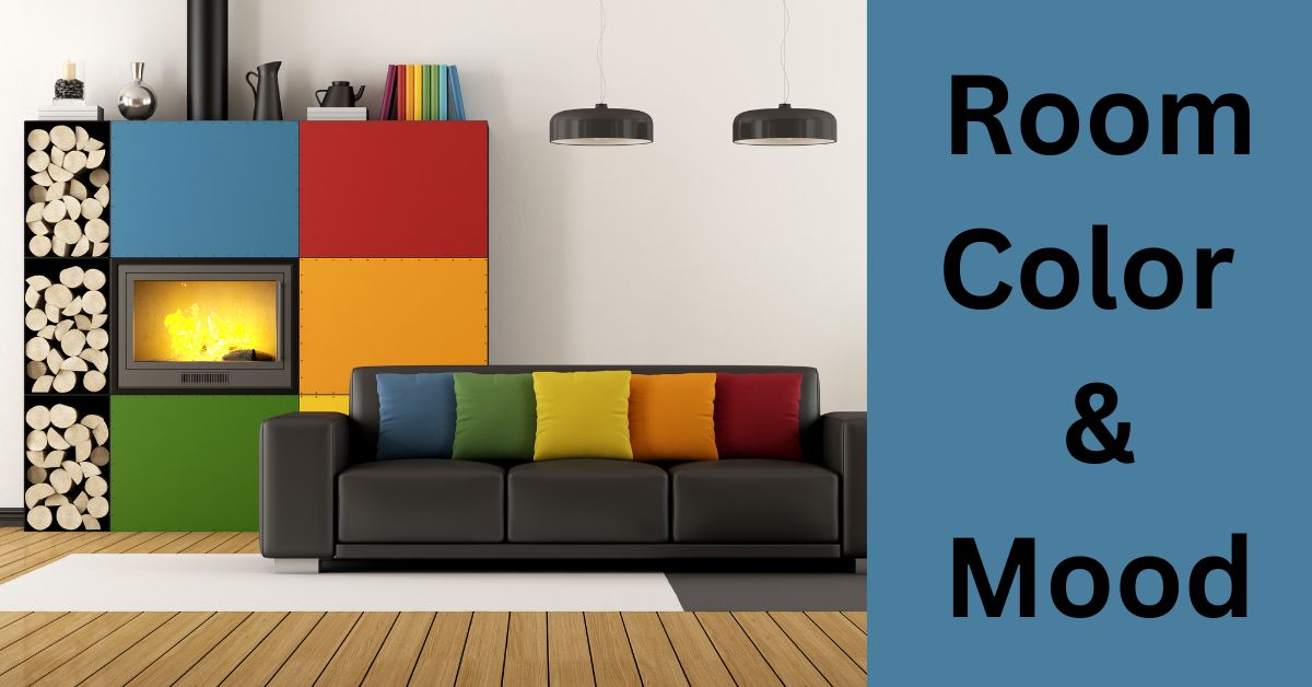
Color and Mood are Connected
Use the relationship between room colors and moods to decorate your home and create the effect and ambiance you want. Using color psychology will enhance your mood and you will experience your home in a new way.
And it’s not just about paint. In this post, we also touch on LED color lighting and circadian light technology.
4-part Strategy for Room Color and Mood in the Home
The color in a room influences our mood. This is because the colors we see around us can release brain chemicals that affect us both emotionally and physically. For example, some colors are associated with increases in blood pressure and metabolism.
And let’s not forget that it isn’t just about the color of the paint on the walls. In fact, when it comes to a home remodel, it is the color of the paint that comes last.
Flooring, cabinetry, countertops, wall tile, textiles, furniture, and accents all have color. And they all contribute to the overall color scheme and its effect on us.
So here is a 4-part strategy for using color psychology in enhancing your mood, wherever you are in your home. And let’s not forget that our mood should reflect the purpose of the room we are in at the time. So our choice of color should have the effect of reinforcing the desired mood.
- Determine a basic color scheme for your home based on the underlying mood you wish to create for each room.
- Do this in such a way that there will still be continuity and cohesion of effect throughout the home.
- Do it in proportion.
- Modify the effect at will by the use of LED lighting technology to introduce circadian lighting and at-will color effects.
- Related post: Color in Design
Color and Mood
But let’s first look at the relationship between color and mood.
It is a well-researched and documented fact that color, and the light that conveys it, appear coded into the human psyche.
Here is an example of what science tells us: How Colors Affect Us. And you will see that more work needs to be done. Nonetheless, the basic effect of certain colors is well documented. And it is not for nothing that the marketing arms of major corporations use the psychology of colors in selling their products.
Just by way of example, that can of tomato juice you bought the other day is not naturally red. It contains food dyes. Otherwise, it would have an unappetizing brownish color.
Room Colors and Mood in our Home
But when it comes to the selection of the right colors for the rooms in our home, there are two things in play. One is our own personal color preferences developed over time. The other is what appear to be color preferences innate to the human psyche.
Personal Color Preferences
Our personal color preferences get shaped as we get feedback from life’s experiences. We just develop our own emotional responses to different colors. Some colors “look good” to us and others just “look bad.” And there are cultural influences that come into play too.
- Related post: Color in Culture
Innate Color Preferences
The pretty much universally acknowledged effects of individual colors on the human psyche are set out below. And we have assigned the mood most associated with the color and where it would seem most appropriate within the home. This is based on the innate effect these “mood” colors have on us
Color theory
Here is the basic breakdown of colors, the moods that a color engenders, and the rooms in which a color is best used.
Warm Colors
Warm colors generally have a somewhat arousing effect on emotions. So use them for rooms that will benefit from the energy warm colors engender.
Red
Red is the most powerful and intense color in the spectrum. It stimulates the emotions of love, hate, and anger. It is such a stimulant that it has been shown to increase heart rate, and respiration rate, and even raise blood pressure.
Use red in the entryway, dining room, and living room. But it is also best used in moderation to avoid overpowering the room. So think of it as best used in accents.
Pink
Pink is a less saturated version of red. And compared to the passion and heat of pure red, it engenders feelings of charm, romance, and kindness.
Use pink in a nursery or bedroom. If you use it anywhere else, you risk creating a “girlie” effect.
Yellow
Yellow is the color of happiness and sunshine. It inspires creativity. Use yellow in the dining room, kitchen, living room, or bathroom.
Orange
Orange is the color of energy. It inspires creativity, excitement, and enthusiasm. Use orange in a home gym or playroom. Avoid it in the living room. You want energy from your guests, not the room color.
Cool colors
Cool colors generally have a calming or soothing effect on emotions. So use them in rooms for unwinding and reflection.
Green
Green is a restful color with a calming effect that can reduce stress. Use green in the bedroom, bathroom, living room, and kitchen.
Blue
Blue is a calming color. It will soothe and has been shown to slow the pulse rate of breathing. Use blue in the bedroom or bathroom. You can use it in a living room but in soft shades.
Purple
Purple is an interesting color. It is neither warm nor cool but simultaneously both. It balances the stimulation of red and the calming of blue. Use purple in the bedroom, living room, or office.
Neutral colors
Neutral colors are a blend of two complementary colors. Depending on their saturation, a neutral color can engender a dark mood or a light mood. They can be used in any room.
Brown
Brown is a comfortable color and is commonly used in traditional decor. It conveys warmth and sophistication.
Grey
Grey is a trending color. It conveys elegance and warmth. It is a versatile color.
White
White is classic and timeless. It is generally calming, although a pure bright white can feel edgy. It is the best color to create spaciousness in a room.
Black
Black can add style but should only be used as an accent.
Using Color Psychology Room by Room
Living room
The living room is for entertainment and company. So the color scheme should feel welcoming and relaxing.
So there are many ways to go with the living room. But you don’t want anything on the walls that is overstimulating. So avoid using red or bright yellow or orange. We would suggest soft greens and blues for maximum relaxation.
Kitchen
In fact, there is probably not much in the way of bare walls left to paint. And what there are needs to work with what is already there. This is unless you have been able to plan the whole thing in advance as part of a full-on remodel project.
That said, a kitchen is a busy place and so you can keep your energy levels high by using warm colors, like red, yellow, and orange. Or consider using a stylish warm gray with splashes of warm colors for accents. Or you could use warm green instead of gray.
Avoid using dark colors like brown or black, as these will bring your energy levels down.
And you can’t go wrong with natural wood cabinetry. It is beautiful, timeless, and traditional in a kitchen
Dining Room
Colors in a dining room should inspire conversation and good cheer. And they should stimulate the appetite.
Reds and oranges will stimulate an appetite and bring warmth but don’t let them overpower the space. Also, green will bring a feeling of freshness and relaxation. It will also soothe.
Avoid dark colors like brown or black. These can have a dampening effect on your dining company.
Home Office
For an office, you want a feeling of quiet energy. You want to feel focused but creative at the same time. Blues and grays are good for the home office. But you can add some splashy artwork for inspiration.
Bathroom
One’s bathroom is a refuge. And its colors should be calming and serene. Avoid stimulating warm colors. Rather use warm-shifted neutral or cool colors. Blues, greens, and grays are good for bathrooms.
Bedroom
The bedroom is for relaxation and sleep. So you don’t want any color that does not engender a feeling of calm.
Warm blues and greens are good colors for the bedroom. Grey also has a calming effect. And lavender is exceptionally calming. But avoid cool blues. These can have a chilling effect.
Avoid using red, orange, and yellow. These are overstimulating. And avoid dark brown, which can have a dulling or even depressing effect.
Colors in Proportion – 60:30:10 Rule
In our post on how to use the rules of design in remodeling, we talk about the 60:30:10 rule of proportions. The idea is to achieve color balance and, therefore, harmony.
- Related post: Design Elements & Principles
Here is how it works generally concerning colors:
The principle is that the theme takes 60% prominence; the contrast accounts for 30%; the remaining 10% provides the accent.
So, if we are talking about paint alone, 60% is the dominant color; 30% is a secondary color; 10% is an accent color.
Of course, the colors in a room are not only paint. Of the room as a whole, 60% of the color is on the walls; 30% of the color is on the furniture and upholstery; and 10% of the color is on accent pieces, such as artwork.
And to remain restful to the eye, no more than 60% of the room should be occupied by furniture and accessories. This is to leave plenty of “white space” in order not to overwhelm the eye.
Creating Home Cohesion Among Room Colors
If you have a home that is made up of rooms with different, even clashing, colors, the effect can be disconcerting, as one moves from room to room.
So, we need to find a way of creating a sense of cohesion and flow among the various spaces in the home. This can apply within individual rooms too.
Cohesion Tips
1: Choose a relatively subdued base color throughout the home and dress each room with accent colors. The accents can be in the form of accent walls, furniture, or artwork.
2: Use a single color for the walls of all connecting spaces.
3: Observe sightlines from one room to the next. You want to avoid colors that clash within sight of each other.
4: Stick to a warm or cool color palette throughout the home.
5: Use common accent colors throughout the home.
6: Stick to a single color for doors, baseboards, and other trim throughout the home.
7: Stick to a relatively subdued wall color throughout the home.
LED Lighting, Color Psychology, and Natural Light
LED technology has created a whole new paradigm in color psychology. Because you can now create or enhance mood at the flip of a switch. And this is a great deal more flexible than the fixed colors and lighting systems currently in our homes. After all, until recently, the only options we had were an on-off switch and a dimmer.
It is beyond the scope of this post to go into the details. But LED lighting systems can deliver a huge variety of lighting effects by the manipulation of light wavelengths, light intensity, light temperature, and color.
This technology is known as chromotherapy in medical applications. It is used to treat psychological disorders, like depression and insomnia. It is a very old concept but it has been given a new dimension with LED technology.
But in our homes, we can use it to create or enhance mood and also enhance performance. We can manipulate mood through the use of color and we can boost natural performance by introducing circadian rhythm lighting.
And we can automate it all with smart home functionalities.
Mood lighting
Here in brief are some suggestions for mood lighting.
Blue light: If we automate our bedroom light to turn blue when we wake up, we awake more easily. We can also use blue light for feelings of relaxation and serenity, which makes it great for meditating.
Green light: Green is nature’s color and it is the color of healing. It is helpful in surgical operating rooms. So at home, it’s light to use if we feel unwell. Green also enhances concentration and retention. So it’s good to use in a home office too.
Pink light: Pink is associated with feelings of innocence and tenderness. It is a soothing light to use should we need to calm anger.
Yellow light: Yellow is the light of sunshine. It is a great light to lift the spirits on those cold, cloudy winter days. It has also been used to help with indigestion.
Red light: Red light enhances energy and metabolism. It’s a good choice for the home gym. And use dim red light for bedroom romance.
Purple light: Purple light can reduce mental and emotional stress. It can help us fall asleep. And it’s a good light to relax by.
Circadian rhythm lighting
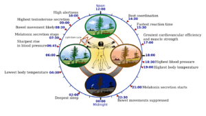
We discuss circadian rhythm lighting in another post, so we don’t need to dwell on it here. But, in summary, circadian rhythm lighting uses LED technology indoors to mimic the effect outdoors of natural daylight from dawn until night.
Over the millennia, our bodies were made to respond best to this lighting as we lived through the day. And until the advent of artificial light, it is pretty much all we knew. So, while it is no substitute for natural light, circadian rhythm lighting is beneficial to us.
- Related Post: Circadian Rhythm Lighting
Conclusions on Room Color and Mood
Room color is a way of communicating with ourselves and others in a way that can make everyone in our home feel welcome and in a mood that suits the occasion. Used in the right context, room colors can energize us and soothe us.
So in any remodel design, we should take advantage of color psychology. This is both in the traditional color design of a room and also in the embrace of the constantly evolving LED technology that is available to us.

Leave a Reply